Zoom Events: Expo 2.0
Making Expo more intuitive, useful, and scalable.
Role
Design & Product Strategy Lead
Date
December 2022
Challenge
After Zoom Events Expo GA, the product was gaining significant usage (~65% of new events being expo-enabled) and with Expo Builder, each expo being created was more customized, interactive, and complex. How can we make it more intuitive, scalable, and useful for all?
Solution
Optimize Expo attendees’ user-movement to match broader mental models and expectations. Create a searchable and easily explorable floor plan that lets people easily find what they are looking. Create an extensible solution that can scale to many different expo floor sizes and attendees.
The Context
In September of 2021, Zoom released its virtual events platform, Zoom Events. One of the flagship features was Expo (please see the project for context). After Zoom Events GA, roughly 65% of new events were marked as being expo-enabled (roughly ~80 multi-session events per day), meaning customers were choosing to use this optional feature for their events. With increased usage, we received more customer feedback and were able to see how various types of hosted events were stress-testing our framework.
With this knowledge, I set out with the user-research team to create a more extensible framework and set of features that would be able to cover more scenarios and reduce friction for our many users.
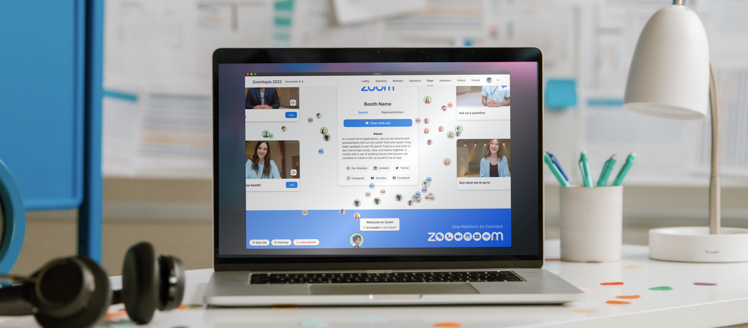
Improved Booth Card
How do attendees learn more about this booth/exhibitor? What’s the most useful information before entering a booth?
We made significant improvements to the exterior of the booth on the expo floor. Previously, we just had the logo and an “Enter Booth” button. In the new booth card, we added a printed name of the exhibitor/booth, the number of people in the booth, and an info button to learn more before entering into the booth. For sponsor booths, we have also included the sponsor tier. I did away with the primary CTAs on every booth to reduce visual clutter conflicting with the logos, and simplified the tap target to enter the booth to be a click anywhere on the booth card.
Clicking on the info icon on the booth card, opens up a panel on the left-side, leveraging the exhibitor profile card, which is accessible outside and inside the booth. This has key information for people to learn more about the exhibitor (description, social links, representatives, etc), as well as view the agenda for what’s happening in the booth and when.
Adding Search
How do attendees locate a booth/exhibitor they are specifically looking for?
In Expo 2.0, we added a search functionality to help attendees find what they are looking for quickly. Sometimes attendees will come into Expo and want to talk to a specific exhibitor, so we shouldn’t require them to navigate their avatar all the way over to that booth in order to enter.
When searching for a booth, the results will be filtered and if you hover over a result, the corresponding booth will be highlighted on the floor.
Navigation
How do attendees know where they are on the expo floor? How can they easily and intuitively explore the expo floor?
Adding a mini-map and showing user location
In the bottom right-hand corner, I centralized “view” controls. You can adjust your zoom level, and based on your zoom level, your view-port is visualized in the blue box superimposed on the mini-map. This shows you how much of the full expo floor you’re looking at. The blue dot signifies where your avatar's location is.
Additionally, this can be dragged around. When you drag this around, it changes your viewport, allowing you to view different parts of the floor.
Specific demographics of attendees are having trouble understanding how to move around on the Expo floor
Addressing the problem: - Improving User Navigation
With the original iteration of Expo, we had two methods of moving your avatar around:
Click-to-advance
We took inspiration from the movement of many top-down RPG-style games. You click you mouse somewhere and your avatar follows. It was a pretty quick follow, so there was not a very large lag time
Arrow keys (allowing more incremental/structured movement)
Initially, we received positive feedback from our user-movement model from research participants and they thought it was intuitive and easy to learn. However, upon reflection, our sample size may have been too small, resulting in a solution that only worked for a certain demographic. We had about 20 research participants, contrasting from the feedback that thousands of Zoom Events attendees give to us.
One common piece of feedback from enterprise customers found that older attendees were having trouble navigating their avatar and it wasn’t behaving how they were expecting. They were used to using map-type interfaces a lot and were familiar with being able to drag the map around to explore. We added a 3rd way of movement which allowed us to service all different types of attendee demographics—tech-savvy or not. This was met with a very immediate and large positive response from our customers.
Extensibility
How can we create a more extensible solution that scales better for huge expo floors and reduce performance drain?
Simple View
With Expo GA, the spatial-style top-down view was key to driving interest in the Zoom Events platform. It was met with a positive response and had a wow-factor that won over many prospective customers. It was constantly listed as one of the top Zoom Events features on marketing material.
Realizing this, we understood that not every attendee’s computers/devices could handle the performance demand while processing the spatial view of an Expo with thousands of attendees. We realized we needed to create a more simplified view that would allow Expo to scale to extremely large events or for those who want to do away with the spatial movement and avatar experience (we had one customer that held a book fair with 300 booths, all informational and each booth dedicated to 1 book).
This view of the expo keeps all of the value of the expo inside the booth but does away with the avatar navigation. Some may like the simple view, so we allow event organizers to choose between Spatial View and Simple View.
This allows Zoom Events Expo to scale almost infinitely, as it is much less of a performance load than Spatial View. Additionally, Simple is much more scalable across devices while Spatial View is only available on tablet and larger breakpoints.
Expo on Native Mobile
The work done for Simple View on mobile-web, paved the way for the Expo feature in the native Zoom Events experience.
Why does this matter?
Making an experience more intuitive and meeting the needs of customers is key to driving repeat usage and showing care to customers.
Having an extensible product allows for more coverage of different event types and use-cases.
With a majority of events having Expo enabled, it’s important for us to hone in on usability and ease of use.